A memorable logo rarely begins with a perfect idea on a blank screen. Behind an effective brand mark is a structured professional logo design process that connects business strategy, audience research, creative exploration and technical refinement. The finished symbol may look simple, but that simplicity is usually the result of careful decisions rather than a quick template choice.
Understanding the process helps business owners give better feedback, set realistic expectations and recognise the difference between a decorative graphic and a logo built for long-term use. This guide explains each stage—from the initial logo design brief to the final files and brand guidelines.
What Is a Professional Logo Design Process?
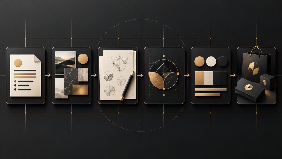
A professional logo design process is a sequence of strategic and creative steps used to turn a brand’s purpose into a distinctive visual mark. It normally includes discovery, research, concept development, sketching, digital refinement, presentation, revisions, testing and final handover.
The process is not about producing dozens of random options. It is about exploring the strongest directions, testing them against real business needs and refining the most suitable concept into a reliable identity asset. If you are still deciding whether custom design is worth the investment, read why professional logo design matters for small businesses.
The Professional Logo Design Process: 9 Essential Steps
1. Discovery and the logo design brief
The first stage is understanding the business before thinking about shapes or colours. A useful logo design brief covers the company’s story, offer, audience, values, personality, competitors, future goals and practical requirements.
- What does the business do, and what makes it different?
- Who is the ideal customer?
- How should people feel when they encounter the brand?
- Where will the logo appear—website, social media, packaging, signage or print?
- Are there existing colours, symbols or brand assets to retain?
- Which visual clichés or competitor similarities should be avoided?
A clear brief gives the designer a strategic target. Without it, feedback often becomes subjective: “make it pop” or “try something more modern” cannot replace agreed brand objectives.
2. Brand, audience and competitor research
Research helps the designer understand the visual language of the sector without simply copying it. This stage reviews competitor identities, common category signals, audience expectations and opportunities to create meaningful distinction.
The aim is not to make the logo look strange for the sake of originality. It should feel appropriate to the market while remaining recognisable and ownable. A premium consultancy, children’s brand and technology startup may each require a different balance of authority, warmth, energy and simplicity.
3. Creative direction and moodboards
Before detailed logo concepts are developed, the designer may establish one or more visual directions. Moodboards can combine typography references, colour moods, textures, photographic styles and abstract forms. They help align expectations early, when changing direction is still efficient.
This stage also begins the wider brand identity design process. A logo does not operate alone; it needs to work naturally with the visual system surrounding it.
4. Sketching and logo concept development
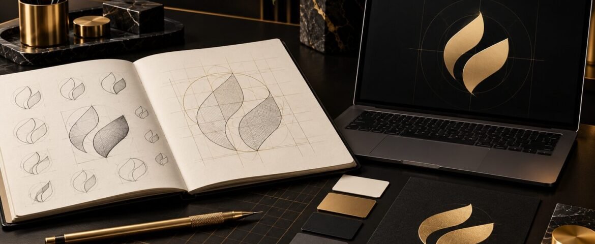
Sketching allows ideas to develop quickly without becoming distracted by perfect curves or software effects. Designers explore wordmarks, monograms, symbols, negative space, letter relationships and visual metaphors. Many rough ideas may be tested before a small number of promising concepts are selected.
Good logo concept development asks more than “does this look attractive?” Each idea should connect to the brief, remain distinctive, reproduce clearly and avoid unintentional meanings.
5. Digital construction and refinement
The strongest sketches are rebuilt as vector artwork. This makes the logo scalable without losing quality. The designer adjusts proportion, alignment, spacing, geometry, stroke weight and optical balance. Mathematical precision can help, but visual judgement is equally important because perfectly measured shapes do not always look perfectly balanced to the human eye.
Concepts should first work in a single colour. If an idea depends on gradients or effects to remain recognisable, the core mark may not be strong enough.
6. Typography and colour development
Typography shapes the character of a wordmark and influences the tone of the entire identity. A designer may customise existing letterforms or create a bespoke arrangement to improve distinction and spacing.
Colour is chosen for relevance, contrast, accessibility and practical reproduction—not only personal preference. The logo should be tested in full colour, black, white and greyscale. Exact colour specifications can later include HEX and RGB values for digital use and CMYK values for print.
7. Building a responsive logo system
Modern brands appear across tiny profile icons, mobile headers, websites, packaging and large signage. One fixed layout may not suit every space. A professional logo package can include a primary logo, secondary arrangement, compact mark, icon and monochrome versions.
This flexible approach protects consistency while allowing the identity to remain clear at different sizes. It also supports a coherent website and social presence; our graphic design and branding service develops visual assets as a connected system rather than isolated files.
8. Presentation, feedback and revisions
Professional presentation gives context to each concept. The designer explains the strategic idea, construction and connection to the brief, then shows relevant applications such as a website header, social icon, business card or packaging mockup.
Useful feedback is specific and objective. Instead of asking which option a colleague “likes”, compare each concept with the agreed goals: Does it communicate the right personality? Is it distinctive in the market? Will it work in every required format?
Revisions then strengthen the chosen direction. Combining unrelated parts from every concept can dilute the idea, so changes should solve a clear problem rather than create a design by committee.
9. Final logo files and brand guidelines
Once approved, the logo is prepared for real use. A complete handover should make it easy for printers, developers, marketers and internal teams to choose the correct version.
- Vector files: SVG, EPS or PDF for scalable professional use.
- Raster files: PNG and JPG for everyday digital applications.
- Colour versions: full colour, black, white and single-colour options.
- Logo variations: primary, secondary, compact and icon formats where required.
- Brand guidelines: clear space, minimum size, colours, typography and incorrect-use examples.
Before the project closes, confirm usage rights, licensing and file ownership in writing. Store the master files safely rather than relying only on low-resolution images copied from social media.
How Long Does the Logo Design Process Take?
A focused logo project may take two to four weeks, while a broader brand identity can take longer. The timeline depends on research depth, number of decision-makers, feedback speed, revision rounds and the number of final applications required. Rushing discovery or approving concepts without testing can create expensive changes later.
What Makes a Logo Process Professional?
- Business strategy guides the creative decisions.
- Concepts are original and relevant rather than copied from templates.
- The mark is tested at small and large sizes.
- Black-and-white performance is considered before effects.
- Feedback and revision stages are clearly defined.
- Final files cover digital and print requirements.
- The client receives practical guidance for consistent use.
The result should not only look polished on a presentation slide. It should remain functional on a website, social profile, invoice, sign or product. When a new identity is ready, pairing it with professional website design helps the brand feel consistent from the first customer touchpoint.
Frequently Asked Questions
How many logo concepts should a designer provide?
Quality matters more than quantity. Two or three well-researched directions are often more useful than dozens of weak variations. The proposal should clearly state how many concepts and revision rounds are included.
What information belongs in a logo design brief?
Include your business background, target audience, offer, competitors, brand personality, applications, existing assets, preferences, restrictions, timeline and decision-makers.
What logo file format is best?
SVG is excellent for scalable digital use, while EPS or print-ready PDF files are common for professional production. PNG files are useful when a transparent background is needed, and JPG files suit simple everyday previews.
Is a logo the same as a brand identity?
No. The logo is one identifying asset. Brand identity is the wider visual system, including colours, typography, imagery, layout principles and application rules.
Build a Logo That Works Beyond the First Impression
A strong logo is not simply drawn; it is discovered, tested and refined. The Visual Spark is a UK-based creative studio serving clients worldwide with strategic logo design, brand identity and practical visual systems. Explore our creative services or contact The Visual Spark to begin a professional logo design process built around your business.
Leave A Comment