
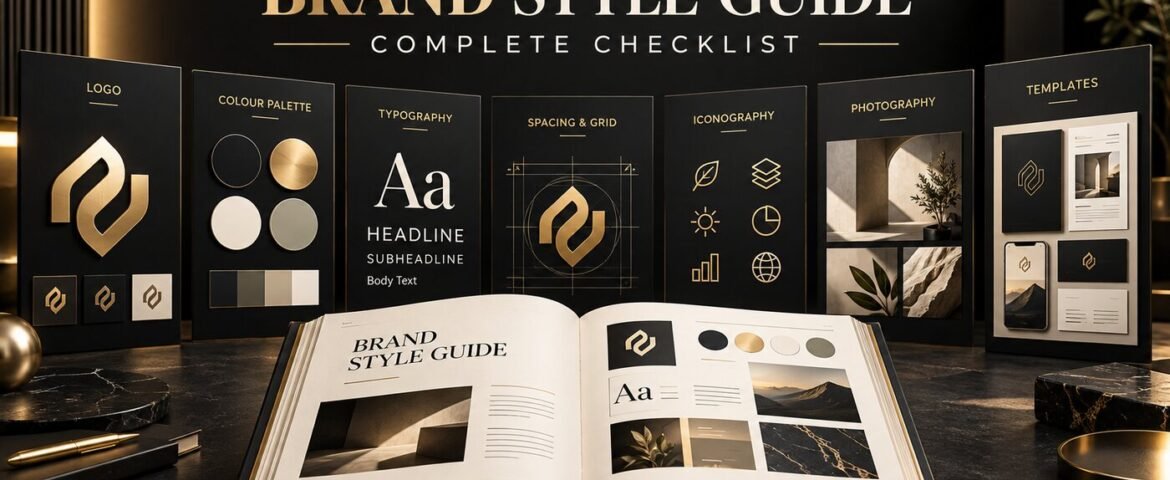
A brand style guide turns creative decisions into a practical system that anyone can follow. Without one, a business may use different logo versions, colours, fonts and writing styles across its website, proposals, social posts and advertising. Each item can look acceptable on its own while the brand as a whole feels inconsistent.
A useful guide does more than display a logo and a few colour swatches. It explains what the brand represents, how visual and verbal elements should be used, what should be avoided and where approved assets can be found. This complete checklist shows what to include so employees, designers, marketers and external partners can create with confidence.
What Is a Brand Style Guide?
A brand style guide—also called brand guidelines, a brand book or identity guidelines—is a reference document for presenting a brand consistently. It usually covers the visual identity, such as logos, colours, typography and imagery, as well as the verbal identity, including voice, tone and core messaging.
Adobe’s guidance describes a style guide as a rulebook for what a brand designs and creates, including fonts, logo treatments and colour schemes. It also recommends documenting personality and voice, not only appearance. The exact length can vary, but the document should remove common guesswork for the people who will actually use it.
Why Does a Business Need Brand Guidelines?
Consistency improves recognition and makes a growing business easier to manage. A clear guide reduces repeated approvals, prevents distorted or outdated logo use, speeds up content production and helps suppliers deliver work that fits the brand from the first draft.
It also protects the strategic thinking behind the identity. The Visual Spark’s graphic design and branding service builds brand systems for practical use across digital and print—not only a single logo file. If a business is still developing its identity, our guide to the professional logo design process explains what happens before guidelines are finalised.
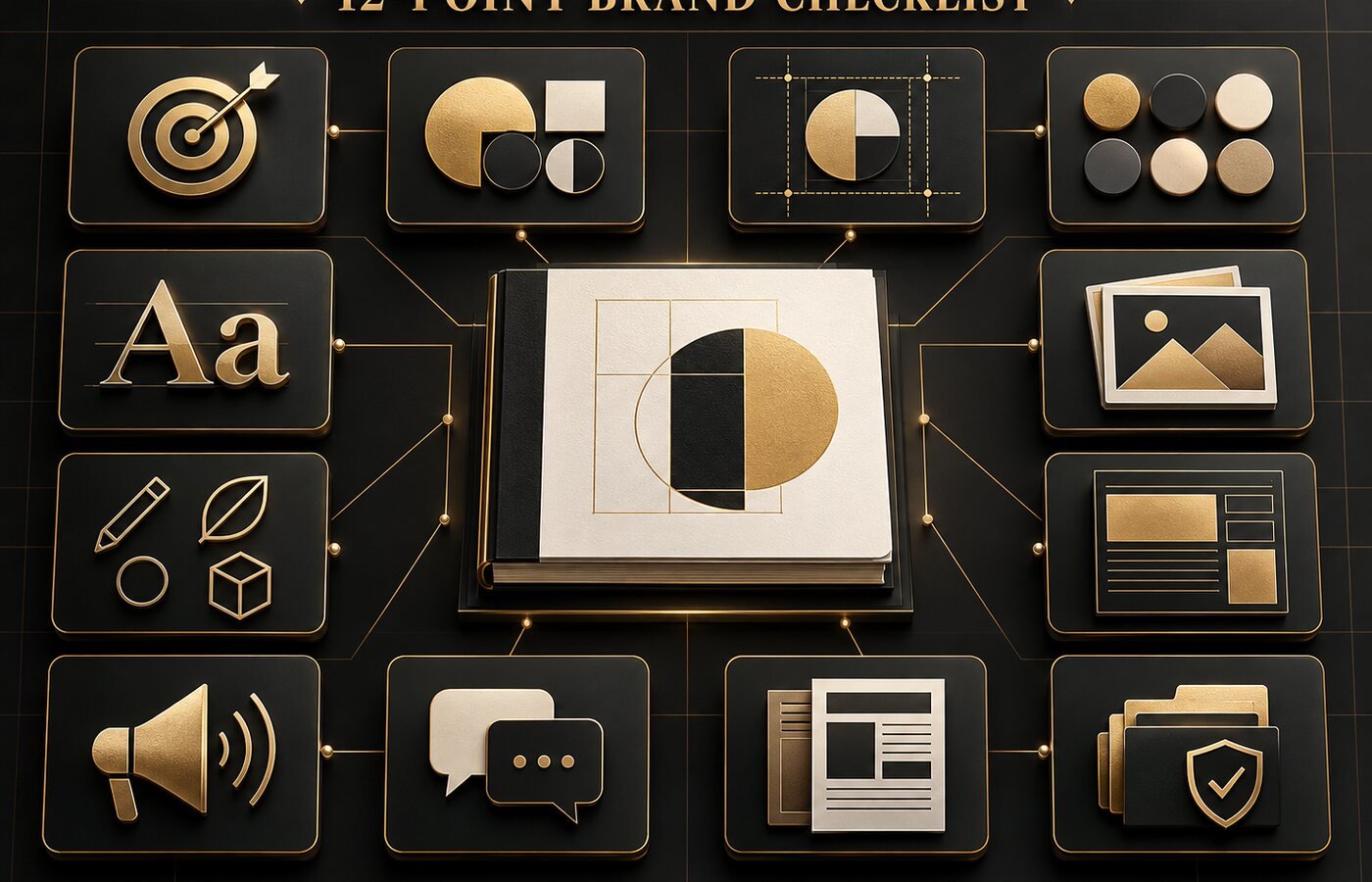
What Should a Brand Style Guide Include? 12-Point Checklist
1. Brand purpose, audience and positioning
Start with a short strategic foundation. Explain why the brand exists, who it serves, the problem it solves and how it should be positioned against alternatives. This section helps people make sensible decisions when a situation is not covered elsewhere in the guide.
Include: mission or purpose, primary audience, value proposition, positioning statement, brand promise and three to five personality traits. Keep the language concise enough to be used, not filed away.
2. Logo suite and file formats
Show every approved logo variation and explain its purpose. A typical suite may include a primary logo, secondary lock-up, wordmark, symbol, horizontal version, stacked version and social-media avatar. Include full-colour, monochrome, reversed and transparent-background versions where appropriate.
Include: links to master vector files for print, PNG or WebP files for digital use, and guidance on when each version should be selected. A professional identity should remain recognisable in both large and small applications; our article on professional logo design for small businesses explains why flexibility matters.
3. Logo clear space, minimum size and misuse rules
A logo can be technically correct and still look wrong when it is crowded, stretched or placed on a conflicting background. Define a repeatable clear-space unit, such as the height of one letter or a component of the mark, and specify minimum digital and print sizes.
Include: correct placements and visual examples of prohibited use. Show that the logo must not be stretched, recoloured without approval, rotated, outlined, given extra effects, rearranged or placed over low-contrast imagery. Visual “do and don’t” examples are often clearer than long paragraphs.
4. Brand colour palette
Document primary, secondary and supporting colours with exact values for different production environments. Avoid defining a colour only by a name such as “navy” or “gold,” because software and suppliers may interpret it differently.
Include: HEX and RGB values for screens, CMYK values for process printing and Pantone references when accurate spot-colour reproduction matters. Explain recommended colour proportions and approved combinations. For digital interfaces, test text and background combinations against the W3C’s contrast guidance so brand consistency does not reduce readability.
5. Typography system
List the approved typefaces, licensed sources, weights and fallback fonts. Define which font is used for display headings, subheadings, body copy, captions, buttons and numbers. A typography system should create hierarchy while remaining readable across print and screens.
Include: examples of heading levels, body sizes, line spacing, paragraph spacing, letter spacing and capitalisation rules. Add web-safe or system fallbacks for situations where the main font is unavailable. If non-Latin languages are used, specify compatible typefaces rather than assuming one font supports every script well.
6. Photography and image direction
Define what an on-brand photograph looks and feels like. Consider subject matter, composition, lighting, colour temperature, contrast, cropping, backgrounds and the level of polish. The goal is not to make every image identical, but to make the collection feel related.
Include: a small mood board, approved examples and examples to avoid. State whether imagery should feel candid or staged, bright or dramatic, minimal or detailed, and whether filters or overlays are permitted. Add basic accessibility guidance for meaningful alt text on websites and digital content.
7. Illustration, icon and graphic-element rules
Custom illustrations, icons, patterns, shapes and textures can become strong brand assets when their construction is consistent. Without rules, new graphics can quickly look as if they belong to different companies.
Include: line weight, corner style, level of detail, fill treatment, perspective, texture and approved colour use. Explain whether icons should be outlined or solid and how they align to a grid. Provide original files or an approved library so users do not substitute random stock graphics.
8. Layout, spacing and composition principles
A brand is recognised through composition as well as individual assets. Define how much white space is typical, how content aligns, how grids work and where calls to action appear. These principles help a website, proposal and social post feel connected even when their dimensions differ.
Include: grid examples, margin rules, preferred alignment, image-to-text balance, border radius, shadow use and hierarchy. Digital guidelines should also cover responsive behaviour. A professional website design service can translate the brand system into reusable interface components rather than treating each page as a separate design.
9. Brand voice and tone
Brand voice is the consistent personality behind the words; tone changes with the audience and situation. A friendly brand may sound celebratory in a launch announcement and calm in a support message without losing its underlying character. Mailchimp’s public voice and tone guidance is a useful example of adapting tone to a reader’s emotional context.
Include: three to five voice traits, each explained with “we are / we are not” contrasts. Add preferred vocabulary, words to avoid, grammar conventions, inclusive-language guidance and before-and-after copy examples. A content and copywriting service can turn abstract traits into repeatable messaging examples.
10. Core messaging and naming conventions
Document the phrases that should remain consistent wherever the brand appears. This prevents teams from describing the same product, service or audience in conflicting ways.
Include: official brand name and capitalisation, tagline, short company description, extended boilerplate, key value propositions, product naming rules and approved calls to action. Provide examples rather than asking users to interpret broad instructions such as “sound premium.”
11. Channel examples and reusable templates
Guidelines become easier to apply when they show real outputs. Include the channels the business uses most often: social media, presentations, proposals, stationery, email signatures, packaging, advertisements or website components.
Include: editable templates, dimensions, safe areas and examples of strong application. Templates should protect key decisions while leaving enough flexibility for new content. Campaign teams can also use the principles in our social media ad design guide to balance brand consistency with performance-focused creative.
12. Asset access, ownership and review process
A beautiful guide is not useful if no one can find the correct files or knows who can approve an exception. Finish with practical governance so the system stays current as the business grows.
Include: a link to the master asset library, folder structure, file-naming convention, font licences, contact person, approval process, version number and last-updated date. Review the guide after major changes to services, audience, platforms or identity assets.
How Long Should Brand Guidelines Be?
A small business may only need a focused 10–20 page guide, while an organisation with multiple products, regions and channels may need a larger brand book and separate digital or editorial standards. Length is less important than usability. Cover the decisions people make repeatedly, show real examples and provide the files required to follow the rules.
A concise guide that teams use is more valuable than an impressive document they ignore. Start with the essential identity and messaging rules, then add sections when genuine needs appear.
Brand Style Guide Quality Checklist
- Can a new team member understand the brand’s audience and position?
- Are all approved logo versions shown with usage rules?
- Are colour values provided for screen and print?
- Does typography guidance include hierarchy and fallbacks?
- Are imagery, icon and graphic styles demonstrated visually?
- Do layout rules cover responsive digital use?
- Are voice traits supported by real writing examples?
- Are names, taglines and core descriptions consistent?
- Can users access approved files and editable templates?
- Is ownership and the review date clearly documented?
Frequently Asked Questions
Is a brand style guide only for large companies?
No. Small businesses often benefit quickly because the owner, freelancers and suppliers need one reliable reference. The guide can begin small and expand with the business.
What is the difference between a brand strategy and a style guide?
Brand strategy defines the audience, positioning, promise and long-term direction. The style guide converts that strategy into practical visual and verbal rules. A strong guide includes a short strategic summary but does not replace the full strategy.
Should brand guidelines include editable templates?
Yes, when the business repeatedly creates similar materials. Templates for social posts, presentations, proposals or email headers make correct application faster and reduce accidental inconsistency.
How often should a brand style guide be updated?
Review it at least annually and whenever the brand launches new services, enters a new market, redesigns important channels or adds major identity assets. Small clarifications can be versioned without redesigning the entire brand.
Build a Brand System People Can Actually Use
A complete brand style guide creates consistency without removing creativity. It gives everyone the same foundations—strategy, logo rules, colour, typography, imagery, voice and practical templates—so new work feels recognisable and intentional.
The Visual Spark is a UK-based creative studio serving clients worldwide with logo design, visual identity, brand guidelines, website design and content support. Explore our creative services or contact The Visual Spark to build a professional brand system that remains consistent as your business grows.
Leave A Comment